How To Decorate a Wedding Sign
Sarah YoungDecorating a wedding sign is about more than just the way it looks.
It’s about capturing the essence of your special day and sharing it with your guests as they enter into the celebration.
If you want a floral sign, it's best to ask your florist to decorate your sign, as this takes another job off your plate!
But if you want some more inspiration, here are four top tips to help get you going:
Techniques & Inspiration
1. Layering Textures for Depth and Interest
Texture is an often-overlooked feature on signs.
Combining them can add depth and interest to a sign, making it a piece of art as well as an informative tool.
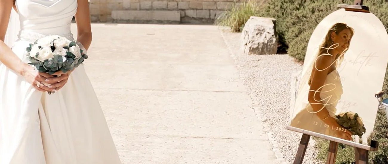
3D acrylic signs are a great example of this, including this sign shown below:
Also consider a wooden sign with layers of paint and stain to highlight natural grain and attract attention:

Burlap and other rustic materials can make elegant lettering pop and create a rustic-chic look.
Silk adds elegance, and velvet makes for a soft sheen on your sign:

You can even use natural materials like moss and bark for a 3D, forest effect that will catch eyes and create smiles.
Need a personalised wedding sign? Shop our fantastic range here.
2. Incorporating Lighting for Drama and Visibility

One way to elevate the look of the sign and make it even easier to notice, even in the evening, is to use lighting.
Fairy lights are whimsical and fun, but also elegant and functional.
A marquee of lit letters can highlight the happy couple’s names, or place words of love and hope around the venue:

Modern weddings might want the bright colours of neon standing out against the night sky.
3. Personalization Through Calligraphy or Hand-Painting
Custom calligraphy can be an elegant way to show your unique style.
Classic and adaptable, calligraphy can look almost any way you want it to, fitting in with your theme and aesthetic.

Hand painting adds depth and charm to designs, with floral borders, abstract designs, frames, and even classic lettering.
Whether it is watercolour flowers or fine acrylic bordering, hand painting adds a touch of classic style.
Inketch offer a great range of wedding welcome signs that you can customise here.
4. Adorning with Natural Elements for Authenticity

Bringing nature into your sign design can be a stunning way to catch the eyes of your guests.
Flowers, greenery, and natural accents can match the style of the bouquet and the centrepieces, tying the whole décor together in a beautiful, elegant way.

Destination weddings or special venues and seasons can draw from the area around them to augment the signs.
Shells and sand framing the signage at a beach wedding, autumn leaves and gourds highlighting an autumn wedding, and tropical fruit and coconuts decorating a wedding on an island paradise – these are all great ways to tie the theme together while increasing the visibility of the signs.

We have more wedding sign ideas on this post.
Choosing The Best Decorations For Your Wedding Theme
Materials Matter: Selecting the Right Foundation
The choice of materials will set the tone for the sign.
Wood is great for evoking rustic charm and welcome, while acrylic is a sleek, fun way to invite your guests into a modern wedding.
Even metal can be used to evoke vintage or industrial moods. The list is a long one, and whatever the couple has interest in, has a material to match it.
Typography: The Voice of Your Sign
Typography is the style and appearance of printed matter. It refers mainly to the scripts and the fonts.
You can choose an elegant, flowing script, strong and modern block fonts, or something in between.
As long as you remember that the key point of it is for the guests to easily read what they need to know, the choice is wide open.
Colour Scheme: Harmonizing with Your Theme
Colours can draw the eye to your signs, but they should also complement the venue style and wedding theme.
Different colours have different emotional effects, too, so you should keep that in mind when planning your designs.
Soft pastels evoke gentle, romantic emotions, while bold hues can motivate the guests to hit the dance floor and have a great party.
Embellishments: The Final Flourish
Adding floral accents, lights, or fabric can elevate your sign from a simple directive to an artistic element in your wedding theme.
The ideal sign is as beautiful as possible while remaining eye-catching and clear to read.
Positioning: Maximizing Impact
Place your signs for maximum impact.
Imagine the path your guests will take from the parking area through to the main entrance to the venue, and on to any other locations of importance (like restrooms, ceremony or reception rooms, lounges, and gift tables).
Place signs along this path at points of decision to clearly direct them to the right places.
If you're unsure about which wedding signs you actually need, we have a great post here.
Summary:- Choose materials to complement your theme and personality.
- Choose typography that is easy to read and reflects your theme.
- Choose colours that evoke the mood you want for the wedding.
- Use enhancements to highlight signs, without becoming overwhelming.
- Place your sign for maximum visibility and need.
Your wedding signs have a job to do, and they should do that job well – but they should also add to the theme and decoration of your wedding, echoing the uniqueness and joy of your relationship.
There should be enough signs to keep everyone heading the right way, but not so many that they appear cluttered – balance is the key.


