How Big Should Wedding Signs Be?
Sarah YoungEvery detail counts when you’re planning your wedding day, including the size of your signs.
These signs guide your guests and add a magical personal touch to your big day.
The best signage for a wedding day gives you the ideal balance between aesthetics and visibility.
Here's our guide for each type of sign:
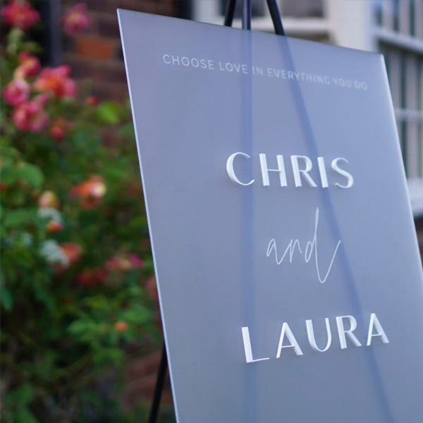
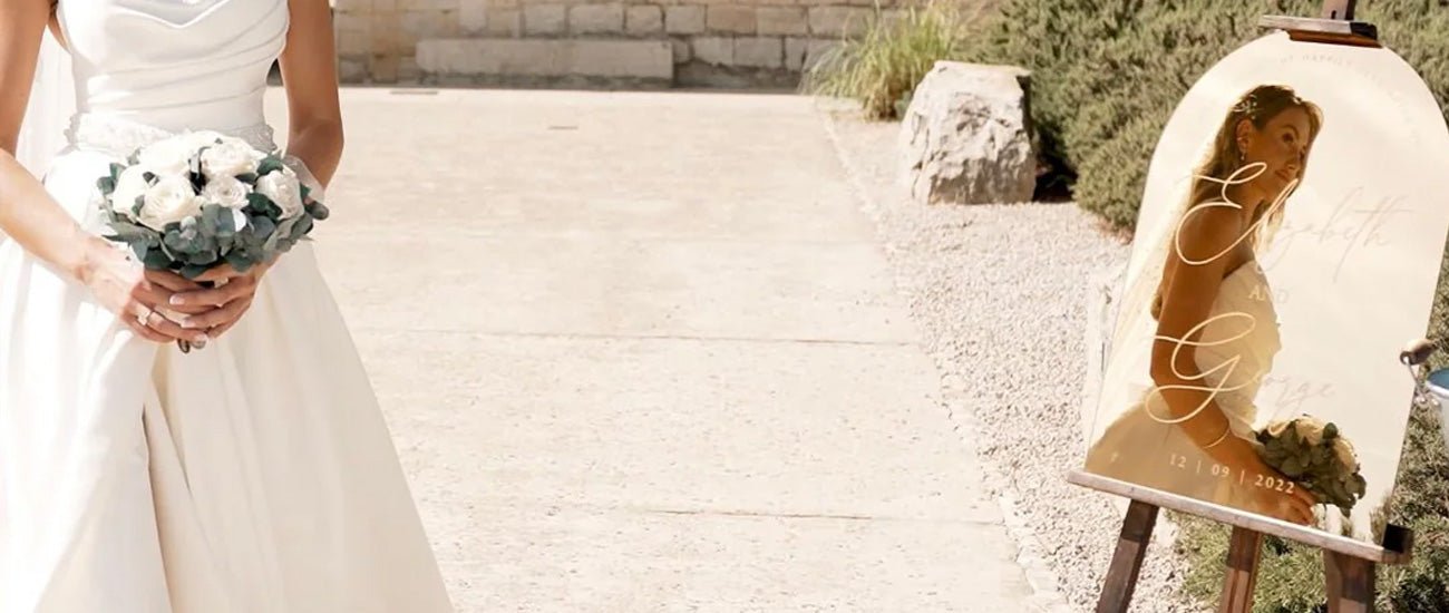
Welcome signs: the first impression
Recommended size: A2 or A1
Optimal font-size: 100-120 pt for your main heading, 60-80 pt for the secondary text
Welcome signs are the first greeting you give your guests and set the tone for your big event
The recommended size ensures your signs are visible at entry points. Larger fonts for your main message ensure your signs are visible from a distance.
You can use smaller fonts for the date and your names, ensuring your welcome message is both clear and detailed.
Still need your sign? Browse our welcome signs at this link.
Seating chart signs: guide your guests with grace
Recommended size: A2 or A1
Optimal font-size: 50-60 pt for guest names, 80-100 pt for headings
Seating charts need precision when it comes to presentation.
Larger signs ensure all names are visible, even when your wedding has a large guest list.
Make sure the font size for your guest names is big enough to be read from a comfortable distance so you can prevent bottlenecks and ensure there’s a simple, quick transition to the seating area.
Browse our personalized wedding signs here.
Directional signs: seamless navigation

Recommended size: A3 or A2
Optimal font-size: 60-80 pt for your directions and 100 pt for arrows or symbols.
Directional signs make it easy for guests to make their way around the venue.
These signs are smaller than welcome and seating charts yet still big enough to catch the eye and deliver clear instructions.
Bold arrows and symbols can complement the text and guide guests toward the ceremony, reception, and rest areas.
You can also choose smaller landscape arrow signs sized to A4 for a more subtle look.
Ceremony and reception signs: enhance the experience
Recommended size: A3 or A2
Optimal font-size: 40-60 pt for the details, 80-100 pt for your titles
Signs that are specific to the reception or ceremony, such as ones that detail the order of events, should be easy to read but not so big that they distract from the décor.
Opt for a slightly smaller size than your welcome sign to communicate clearly without overpowering the space.
Choose clear and legible fonts so guests can easily follow instructions.
Table numbers and menus: delicate details
Recommended size: A4, A5 or A6
Optimal font-size: 30-40 pt for the table numbers, 24-36 pt for your menu items (choose the lower end for an A6 sign).
As table numbers and menus are closer to your guests’ viewpoints, they can be smaller.
You do need to ensure the font is legible so guests can be guided to their seats and they can clear read information about the culinary delights that await them.
Sizes for other small signs
Recommended size: A5 or A4
Optimal font-size: 40-50 pt for your main messages and 30-40 pt for the secondary details
- Gift and cards table signs and guest book signs: These signs are used to direct guests and tell them where to leave guests and sign the guest book. As they have a compact size, they are ideal for table displays. The font size makes sure that the message is clear without the space being overwhelmed.
- Hashtag signs: These are ideal for couples who want the celebrations to spill over onto social media. The size and font are designed to be eye-catching and encourage sharing on social media platforms.
- Health and Safety signs: These signs can be used to remind guests of protocols around health and safety. You can place them in areas like bathrooms and entrances.
Easel measurements
Easels play a pivotal role when it comes to displaying signs.
For larger signs, opt for an easel standing that’s at least 150 cm (59 inches) tall to ensure maximum stability and visibility.
For A3/A4 signs, a tabletop easel around 45-60cm tall will work well.
For any smaller signs, a tabletop easel, around 30 cm tall gives intimate visibility, or consider using a small stand instead.
Blending setting with size
Think about the setting of your wedding when you’re choosing sign sizes.
Large, open outdoor spaces often need bigger signs so they can stand out against expansive backdrops.
Smaller, more intimate venues can be overwhelmed by larger signs.
Make sure you’re tailoring the size of your signs to the environment so you can create a sense of visual coherence and functionality.
Legible fonts and concise wording
The clarity of the messages on your signs is as important as their size.
Choose legible fonts and concise wording to make it as easy as possible for your guests to understand the information on your signs.
Be wary of crowded text and fonts that are overly decorative as these can compromise the efficiency of your signs, no matter how big they are.
The importance of sign placement
Strategically placing your signs ensures they are both visible and useful.
Place your signs in key areas where your guests are likely to gather and make decisions.
These can include close to essential facilities and entrances. Placing your signs in the right areas allows you to use moderately sized signs without compromising their efficiency.
Final Thoughts on Sign Sizes
Following these size and font guidelines will ensure your wedding signs are both functional and beautiful.
Tailor each sign’s typography and dimensions to their setting and purpose to create a seamless experience for your guests. These details can make all the difference when it comes to planning your event.
If you have any questions, feel free the leave them in the comments, or contact us at info@inketch.com


